Sponsored
sotek2345
Well-known member
- First Name
- Tom
- Joined
- Jun 7, 2021
- Threads
- 34
- Messages
- 3,907
- Reaction score
- 4,719
- Location
- Upstate NY
- Vehicles
- 2022 Lightning Lariat ER, 2021 Mach-e GT
- Occupation
- Engineering Manager
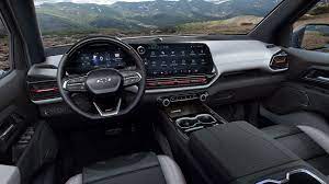
I think the Chevy screen is better integrated into the dash, which I like - but I also prefer the vertical screen because it is easier to reach all of the functions. I prefer the Ford double glovebox setup and center console setup, but like that Chevy has physical HVAC controls (I know the lower Lightning trims do as well).
Overall designwise, I prefer the more squared off setup on the Lightning to the curves on the Chevy.
Overall designwise, I prefer the more squared off setup on the Lightning to the curves on the Chevy.
techguydave
Well-known member
- First Name
- Dave
- Joined
- Oct 16, 2021
- Threads
- 0
- Messages
- 334
- Reaction score
- 355
- Location
- Northeast Ohio
- Vehicles
- None
- Occupation
- IT
Overall, the Chevy. There are things I like about the Lightning like the work surface and the double glove box. But the screen, physical HVAC controls, and lack of a stupid shifter wins bigly for me.
ZWARRIOR
Well-known member
- First Name
- David
- Joined
- Sep 9, 2020
- Threads
- 8
- Messages
- 397
- Reaction score
- 89
- Location
- California
- Vehicles
- 2021 Ford F-150 Lariat 501A 2.7l
- Occupation
- Software Engineer
I like the Lightning's a lot better. Chevy's feel like an SUV at first glance
Sponsored
LHoffmanjr22
Well-known member
It seems odd to me that Ford went away from the horizontal orientation in the Lighting, when it fits so perfectly in the 2021's. I always thought the Ram vertical screen looked like an afterthought that was just kind of tacked on at the last second. But the 2021 Ford screen is so nicely placed, it looks like the rest of the dash was designed around it. Now the Lighting has that same afterthought look, while the Chevy looks much more elegant. Maybe there were other reasons the orientation was changed, but seems like an odd move to me. Either way, I like the Chevy better in this instance.
astricklin
Well-known member
The lower trims of both trucks also have different dash configuration. The Ford loses the tablet and gets a more traditional styled infotainment screen while I believe the Chevy still keeps the same style screen it is just smaller.
sotek2345
Well-known member
- First Name
- Tom
- Joined
- Jun 7, 2021
- Threads
- 34
- Messages
- 3,907
- Reaction score
- 4,719
- Location
- Upstate NY
- Vehicles
- 2022 Lightning Lariat ER, 2021 Mach-e GT
- Occupation
- Engineering Manager
As the screen get bigger, it is hard to reach the far side with a Horizontal setup. Chevy moved it off center to correct for this.It seems odd to me that Ford went away from the horizontal orientation in the Lighting, when it fits so perfectly in the 2021's. I always thought the Ram vertical screen looked like an afterthought that was just kind of tacked on at the last second. But the 2021 Ford screen is so nicely placed, it looks like the rest of the dash was designed around it. Now the Lighting has that same afterthought look, while the Chevy looks much more elegant. Maybe there were other reasons the orientation was changed, but seems like an odd move to me. Either way, I like the Chevy better in this instance.
fitek
Well-known member
- First Name
- Peter
- Joined
- Aug 17, 2021
- Threads
- 10
- Messages
- 153
- Reaction score
- 71
- Location
- Washington state
- Vehicles
- Ford Transit 350EXT
My VW had the center console screen angled towards the driver and after having it I can't ever get in another car without thinking, why does the screen face the center of the backseat?
Fake metal sucks, it looks tacky and the finish wears off. The shifter is dumb. Physical HVAC controls > screen.
Chevy with the win from me. Too bad I hate the exterior, but then again you spend 99% of the time looking at your car from the inside.
Fake metal sucks, it looks tacky and the finish wears off. The shifter is dumb. Physical HVAC controls > screen.
Chevy with the win from me. Too bad I hate the exterior, but then again you spend 99% of the time looking at your car from the inside.
Erik
Well-known member
I prefer the 12” screen on the Pro and XLT. I don’t like iPads bolted on to the dash.
I currently have a 7 inch screen in my car. It would be nice if it was brighter, but the size does not really bother me. With the 360 view, it may be better to have a 12 inch screen than a 7 inch screen.
What is more important to me is whether I can reach to most common functions in as few clicks as possible and whether I can see key information in front of me. I don’t know about the Silverado WT, but the Lightning Pro has physical buttons.
Sponsored
Sam James
Well-known member
I find it funny how much everyone worries about physical climate controls. We have both on the ID.4. They rarely are adjusted as the smart climate settings are excellent. When we do adjust them I’ve found the screen easier to adjust then looking for the buttons.
The concern is understandable, but I think most will find it a very minor change.
The concern is understandable, but I think most will find it a very minor change.
fitek
Well-known member
- First Name
- Peter
- Joined
- Aug 17, 2021
- Threads
- 10
- Messages
- 153
- Reaction score
- 71
- Location
- Washington state
- Vehicles
- Ford Transit 350EXT
My wife's car has buttons for climate control instead of knobs, and it's a hassle. My Sprinter van had buttons too and I always really hated it. It's a lot easier to turn a knob while in motion and easier to adjust while keeping eyes on the road.I find it funny how much everyone worries about physical climate controls. We have both on the ID.4. They rarely are adjusted as the smart climate settings are excellent. When we do adjust them I’ve found the screen easier to adjust then looking for the buttons.
The concern is understandable, but I think most will find it a very minor change.
Maybe the climate control is smarter now but I find myself adjusting the controls several times in each trip, even if a short one, in all cars. Mostly the fan speed.
yed19
Well-known member
- First Name
- Jay
- Joined
- Dec 6, 2021
- Threads
- 8
- Messages
- 339
- Reaction score
- 295
- Location
- Washington
- Vehicles
- '22 F-150 Lightning Lariat, 2012 RR Sport HSE
Non-physical buttons in general allow for software updating and updates OTA. Shifter is probably good for safety reasons with kids who are used to iPads  .
.
However, with all the changes under the hood, I wonder what is really behind the dash screen in the Lightning? My guess is that there may not even be a firewall (unless it was structurally necessary) anymore and that the space is now taken by the Frunk. Which if you think about that... Would you rather have less Frunk space or the screen more integrated into the dash? I honestly would probably prefer a little more integration but it would definitely be a design trade-off.
However, with all the changes under the hood, I wonder what is really behind the dash screen in the Lightning? My guess is that there may not even be a firewall (unless it was structurally necessary) anymore and that the space is now taken by the Frunk. Which if you think about that... Would you rather have less Frunk space or the screen more integrated into the dash? I honestly would probably prefer a little more integration but it would definitely be a design trade-off.
sotek2345
Well-known member
- First Name
- Tom
- Joined
- Jun 7, 2021
- Threads
- 34
- Messages
- 3,907
- Reaction score
- 4,719
- Location
- Upstate NY
- Vehicles
- 2022 Lightning Lariat ER, 2021 Mach-e GT
- Occupation
- Engineering Manager
Given the Mach-e design, I would expect that the cooling equipment is taking up the majority of the space behind the dash. along with some power electronics and the A/C to D/C charger(s).Non-physical buttons in general allow for software updating and updates OTA. Shifter is probably good for safety reasons with kids who are used to iPads.
However, with all the changes under the hood, I wonder what is really behind the dash screen in the Lightning? My guess is that there may not even be a firewall (unless it was structurally necessary) anymore and that the space is now taken by the Frunk. Which if you think about that... Would you rather have less Frunk space or the screen more integrated into the dash? I honestly would probably prefer a little more integration but it would definitely be a design trade-off.
Similar threads
- Replies
- 9
- Views
- 9,184
- Replies
- 70
- Views
- 13,124


